Everything we build here at Optii is designed to help hotel teams manage their operations more efficiently so they can spend more time doing what matters most: delivering great hospitality.
A big part of that is making sure you have the right data in front of you, because you can't manage what you can't measure. That's exactly why we built the new Housekeeping Benchmark Report. I’m Kimi Kane, Senior Data Analyst here at Optii, and I wanted to walk you through what's in it and why it's a valuable tool for housekeeping leaders.
Our New Report
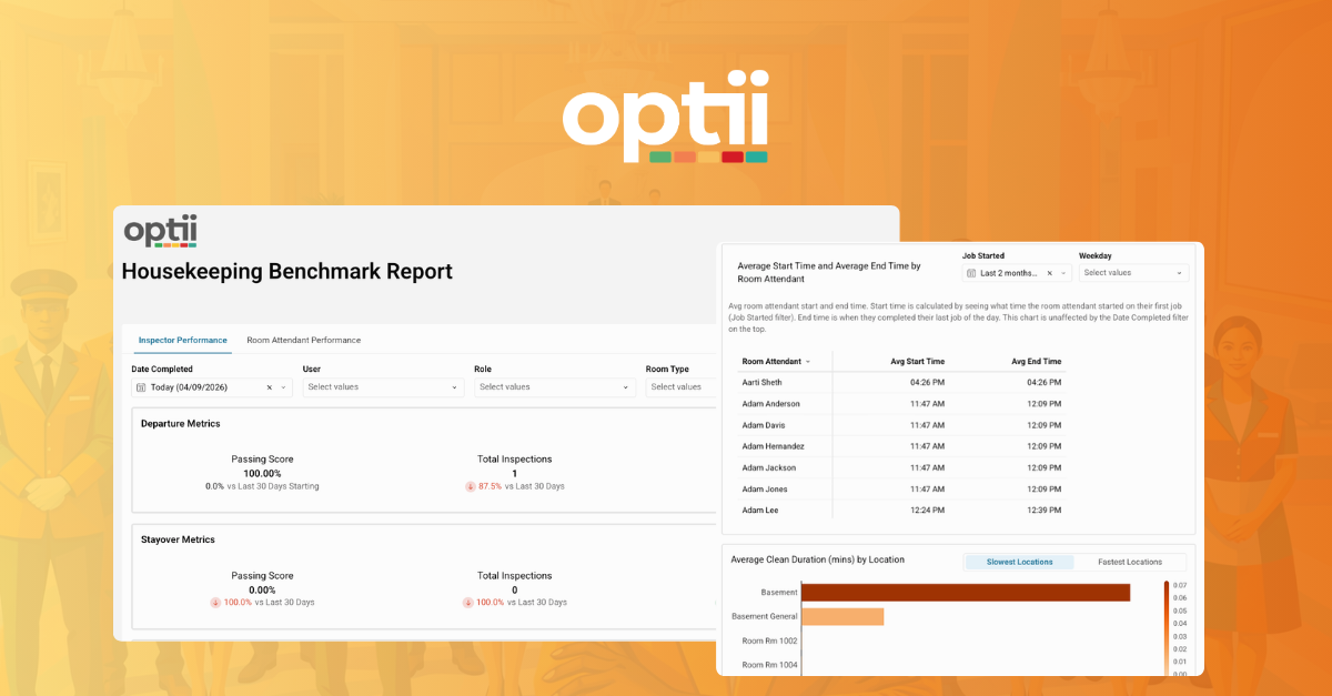
The Housekeeping Benchmark Report gives managers a clear, consolidated view of their team's performance, covering both Room Attendants and Inspectors in a single place. No more cross-referencing multiple exports or manually matching separate reports to understand how your team is tracking. You can filter by role, room type, or individual user to get exactly the view you need.
It's designed to be easy to read and easy to act on, whether you're using it for daily operations or broader performance reviews. And for managers and executives who want this delivered on a regular cadence, reports can be scheduled for automated delivery.
What’s Inside
The report is split into two tabs, each built for a specific purpose.
The first tab focuses on inspection performance. You can see how many inspections each person completed, pass and fail rates, average inspection pass rate by room type, and breakdowns by role. If a certain room type has a higher failure rate, that's something worth digging into, and now you have the data to do it.
The second tab is all about room attendant performance, and this is where I think managers are going to find the most value.
- Average completed credits are visible by room attendant, so you can see what each person's workload actually looks like. If one attendant is carrying significantly more than another, that's a conversation worth having and a chance to rebalance.
- Corrections give you a clear picture of quality. A higher correction percentage signals a need for additional training, and you can see your top and bottom performers by correction count to know exactly where to focus coaching efforts.
- Average start and end times show when each attendant typically begins their first job and finishes their last. There's a weekday filter built in, so if someone works different schedules throughout the week, the numbers won't be skewed. This was a direct request from a team member on our product team, who was a housekeeping manager himself and saw a real need for this kind of visibility.
- 30-day benchmarking lets you compare today's numbers against the last 30 days with clear up and down arrow indicators. A quick glance tells you whether your team is trending in the right direction.
On top of all that, you can compare your slowest and fastest attendants side by side, and do the same by location. If a specific room consistently takes longer to clean, maybe there's something about that room worth investigating.
Why We Built It
We kept hearing from housekeeping leaders that they needed better visibility into how their teams were performing. They wanted to identify gaps, have data-backed conversations with their teams, and make smarter decisions about workload planning and training. This report was built to do exactly that.
Metrics like average start times, correction percentages, and credit comparisons are things that didn't exist in one consolidated view before. Being able to see all of this in a single report means managers can pinpoint issues quickly and take action instead of spending time pulling data from multiple places.
Behind the Build
I do want to share a bit about what it took to bring this to life, because building accurate reports like this requires a lot of thought and testing. Something as straightforward as calculating an average start time is surprisingly complex. Timestamps aren't meant to be averaged like regular numbers, so I had to convert everything into seconds, run the calculations, and then convert it all back into a readable time. It took some creative problem-solving.
The same goes for corrections. When a correction happens, there are multiple jobs linked together: the original cleaning, the inspection, and then the correction job. Connecting all of those behind the scenes so the data surfaces cleanly on the front end took careful work and a lot of testing.
This was a true collaboration between our data, product, UX, and QA teams, and I'm proud of what we delivered. If you have any questions about the Housekeeping Benchmark Report, don't hesitate to reach out to our team here.